Saturday, October 26, 2013

Non-Toxic Paper Lithography with Patricia Cudd

A page from one of Pat Cudd's small books, Bride.  It was made using paper lithography.


From another of Pat's small books, Family.


On Saturday, October 12, Patricia Cudd led the Book Arts Roundtable in a 4 hour workshop on paper lithography.  She began with a brief overview of lithography history:  The first print was done with a stone plate, next came metal plates, then polyester & paper plates.  Pat showed us some wonderful examples of her paper lithography, many of which she bound into very cool small books.  She also bound her experimentation with papers and inks etc, so her results would all be in one place.  And they made more cool books!


Pat shows us one of her aluminum plates.


After the brief introduction, we moved to the studio and got down to business:

Coating the paper plate with gum arabic.

Putting ink on the palette and getting the right consistency.

Inking the plate, with just the right touch.

At the press.

Those of us attending had a wonderful time and we learned a lot!  Thank you Patricia!


Picture credit: Janet Ducote

Wednesday, October 23, 2013

Y, Z, and a Surprise!


Lynn Keffer on her letter:  "In looking for something from nature to illustrate the letter “Y”, I settled on a Yellow Jacket (wasp). Then I composed the limerick and went on from there." 

Front &Back- letterpressed & linocut print, where one side is a derivative of the other (they were cut apart), additional hand coloring.


Linda Mead took the last letter of the alphabet, "Z".
“I chose the word Zephyr, which means a gentle or west wind, because of my love of the wind and the imagery it evokes.”  

Front & Back - hand pulled prints, the letter "Z" combined drypoint with soft ground etching, the image for "Zypher" is an aquatint etching. 


So here is the surprise....a very cool box made by Joe Reilly!  He made it to hold the Abecedarian for BAR.  Thank you Joe!

Very cool box by Joe Reilly


And, we owe an even bigger thank you to Claire Simon for chairing this project for us.  Thank you Claire!


Picture credit: Janet Ducote

V, W, X...


Phyllis Carlin created letter "V".


Elisa Kessler Caporale made the letter "W".  “W was made to look like an illumination.”  Elias also did letter "Q".  

Front - lino cut with marker highlight. 
Back - sponge painted and then printed with a Lino cut


Paula Ehrich tells BAR about her letter "X".


Picture credit: Janet Ducote

S, T, U...


Randy Keenan talks about her experience with her letter "S".

“I had a blast making my “S” cards.  I turned on some music, got out my Sumi ink and just “painted” the shape on the cards then quickly went to the sink and washed off the ink. The dried lacquer stayed black and the ink that hadn’t quite dried was washed off - what a great time I had!  Then on a very rainy day I burned all the edges of the card and used the candle soot to paint the backs.”  

Front & Back - hand painted & own process, Sumi ink, soot, burned.


Joe Reilly and his "T".

“My nature-themed T stands for topiary.”  

Front - original pen and ink drawing, digitally copied onto Canson editions paper,then hand-painted in watercolor and acrylic.  
Back - original acrylic painting, with a collaged banner (also original drawing) in the top section of the image, digitally copied onto the card. 


Karen McDermott explains her work on letter "U".

“Each card has a slightly different watercolor image painted behind the umbrella tree.”  

Front - relief print carved on Mars Carve, printed by hand using black acrylic paint.  
Back - pressure sensitive letters were applied to a surface and then inked with an ink pad and printed. Color was added with pencil and a sponge.


Picture credit: Janet Ducote

P, Q, R...


The letter "P" by Amelia Panico.


Elisa Kessler-Caporale talks about her letter "Q".

“Q is quiet so I made it uncomplicated.”   

Front - sponge painted, then stenciled in a Quince green. 
Back - inspired by a Sharpi sponge painted marker set, hand ruled.


Pat Pacheco's letter R: “R is for roots. Roots bring nourishment to plants and roots connect us to our family and nourish our heart.”

Front - block printed, stenciled.
Back - the pattern was created in word and enhanced in Photoshop, printed on a Canon inkjet printer.


Picture credit: Janet Ducote

M, N, O...


Shari Seltzer poetically describes her letter "M".

“The migratory mocking bird is melodramatically perched on Metropolitan Museum of Art “M”.  A magical mermaid with majestic monarch butterfly wings sits on many mysterious mushrooms.  A marvelous mango mingles among multiples of marigolds. On the back the hand written lower case ”m“ meanders among mellow morning glories and many marigolds. A mild mannered mouse muses multicolored maple leaves.”  

Front & back - hand-pulled gocco print, enhanced with watercolor pigments, the multiple M fonts framing the print were hand stamped with archival ink, slight color variations within the edition are natural part of Shari Seltzer’s fluid style of gocco color application and printing.


Debbie Livingston made a delicious dessert to illustrate her letter "N"!

"Edible N: I have always wanted to make an alphabet cookbook. One snowy day when my kids were little, we made "C soup". It was a corn & crab chowder where all the main ingredients started with the letter c. For this collaborative project I selected the letter "N". I looked up ingredients that started with N and made a Nectarine, Nut and Neufchatel cheesecake. The front of the card has a large letter N surrounded by nectarine and nut plants. The back has an illustration of the finished pie with a detachable recipe card. I wanted my card to have an old woodcut feel.”  

Front & back - hand-carved linoleum-block printed on etching press, ink, additional hand coloring in watercolor, recipe card is printed on a computer.


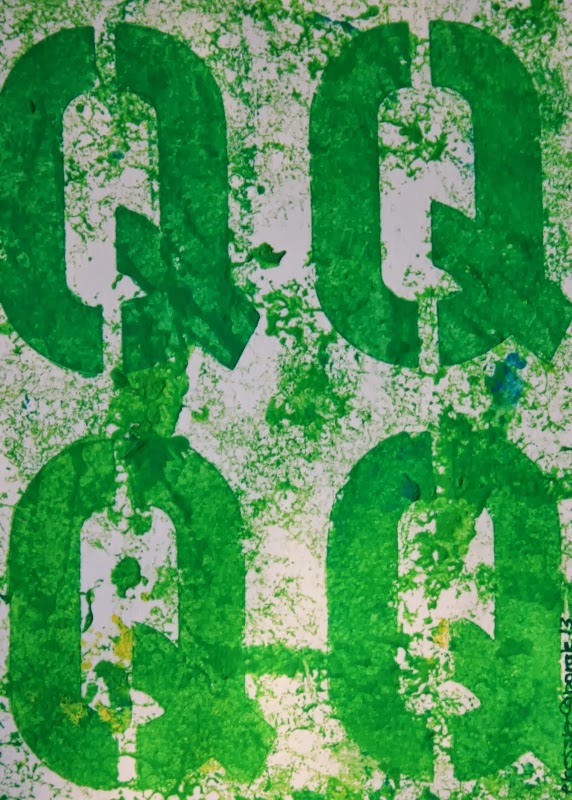
Linda Parker shows her patterned antique roller.

For her letter "O", Linda made an original drawing of a female ostrich, where “the reverse side was designed to simulate the plumage; the colors being grays and browns.”

Front - original drawing photo transferred onto Canson  Editions paper, then printed  on  paper.
Back - gel printed, antique-roller patterned, stamped, acrylic paint.


Picture credit: Janet Ducote

J, K, L...


Benita Wolffe's "J".  She also did letter "D".


"K" is for kelp, by Cynthia Weiss.
Cynthia describes her images of kelp:  On the front, the kelp appears as if it were tossed onto the beach by waves.  On the back, the kelp looks as if is were floating in the water while still attached to the sea bed.

Front & Back - images from trace monotypes transferred onto a Pronto Plate, plate is inked like a lithograph and printed with my etching press, when the ink has dried, color was added with thin semi transparent layers of acrylic gouache, letters are stamped with pigment ink.


Lynn Starun describes her letter "L".

“My letter was "L" and I wanted to letterpress the letter forms from a book by Frederick Goudy--sort of a history of "L".  I chose lilies as my nature theme for the other side.  These were some lovely day lilies I saw in Maine this summer.” 

Front & Back - letterpressed, printmaking paper Rives BFK or Canson Print Editions, with a geli-plate print glued center front, the back is a two plate linoleum reduction print using Caligo inks.  


Picture credit: Janet Ducote